复选框
该节点在可视化树中放置一个可自定义的复选框。

当单击复选框时,它会切换状态,并且其 已选中 属性可以连接到数据源,例如一个 变量 或 对象。
该控件包含了所有的逻辑,例如可访问性等。您可以通过其属性来进行样式设置,或者仅将其用于逻辑,并在自己的设计系统中创建自己的复选框组件。
输入
复选框节点的主要输入是 已选中 输入:
| 属性 | 描述 |
|---|---|
| 已选中 | 一个布尔值,用于设置复选框的 "已选中" 或 "未选中" 状态。这是复选框的值,可以连接到数据源。 |
| 背景色 | 复选框处于 "已选中" 状态时的背景颜色. |
可以使用 启用 输入来启用或禁用复选框:
| 属性 | 描述 |
|---|---|
| 启用 | 指定控件是启用(true)还是禁用(false)。禁用的控件不会对任何用户交互做出响应。 |
复选框节点还具有一组可以设置的标签属性:
| 属性 | 描述 |
|---|---|
| 启用标签 | 设置标签是否可见。 |
| 文本样式 | 将现有文本样式设置给此节点,或根据当前属性创建新的文本样式。 |
| 标签 | 作为按钮标签显示的文本字符串。 |
| 间距 | 标签和复选框之间的间距。 |
同样,它还具有一组图标属性:
| 属性 | 描述 |
|---|---|
| 启用图标 | 设置图标是否可见。 |
| 类型 | 使用此选项设置是否使用预定义的 图标 或项目文件夹中的自定义 图片 |
| 来源 | 获取图标的位置。 |
| 位置 | 设置图标应位于 标签 的 左面 或者 右面 |
| 尺寸 | 图标的宽度(以像素为单位)。 |
| 颜色 | 设置图标的颜色。仅在 类型 设置为 图标 时可见。. |
| 信号 | 描述 |
|---|---|
| 选中时 | 反映用户选中复选框时的相同操作。 |
| 未选中时 | 反映用户取消选中复选框时的相同操作。 |
可视化
该节点支持以下 可视化输入属性:
输出
复选框节点的主要输出是 已选中 输出。
| 数据 | 描述 |
|---|---|
| 已选中 | 一个布尔输出,当此复选框控件被选中时为 true,否则为 false。当使用此控件作为您自己的组件的基础时,此输出对于在视觉上表示其已被选中的组件非常有用。 |
它还具有一组 信号:
| 信号 | 描述 |
|---|---|
| 改变 | 当用户交互更改控件的值时,将在此输出上发送一个信号。 |
| 获取焦点 | 当控制聚焦时,此输出上发送一个信号。 |
| 失去焦点 | 当控制模糊时,即失去输入焦点时,在该输出上发送一个信号。 |
| 指针按下 | 当鼠标按下或手指落在节点上时发出。 |
| 指针弹起 | 释放鼠标或在节点上提起手指时发出。 |
| 悬停开始 | 鼠标进入节点时发出。 |
| 悬停结束 | 鼠标离开节点时发出。 |
状态
除了触发 信号 外,复选框节点还通过 数据 输出通知其状态:
| 属性 | 描述 |
|---|---|
| 启用 | 布尔输出,如果控件处于 启用 状态,则为true,如果控件为 禁用,则为false。当使用此控件作为您自己的组件的基础时,这将非常有用,该组件将直观地表示它已启用或已禁用。 |
| 获取焦点 | 这是一个布尔类型的输出,如果控件处于 聚焦 状态,则为true,否则为false。当使用此控件作为您自己的组件的基础时,这将非常有用,该组件将在视觉上表示它已聚焦。这可能是由于用户选择控件进行输入或使用键盘造成的。 |
| 悬停 | 布尔型输出,当用户用鼠标悬停在该控件上时为true,否则�为false。当使用此控件作为您自己的组件的基础时,这将非常有用,该组件将直观地表示它处于悬停状态。 |
| 按下 | 当用户当前按下控件时为true的布尔输出。当使用此控件作为您自己的组件的基础时,这将非常有用,该组件将直观地表示它被按下。 |
可视化
该节点支持以下 可视化输入属性:
Visual Input Properties
All visual nodes feature a plethora of visual properties that can be accessed both in the Property Panel and through inputs. These are documented below. Plese refer to the individual node documentation pages to see which nodes feature what visual properties.
Margin
Margins are the spacings around the node, outside of the borders. The margins for the node can be set individually in the Spacing Gadget.

| Data | Description |
| ----------------------------------------------- | ------------------------------------------------------- |
| Margin Left | The left margin in px, or % of the parents width. |
| Margin Right | The right margin in px, or % of the parents width. |
| Margin Top | The top margin in px or, % of the parents width. |
| Margin Bottom | The bottom margin in px, or % of the parents width. |
Padding
Paddings are the spacings around the nodes content, inside of the borders. The margins for the node can be set individually in the Spacing Gadget.

| Data | Description |
| ------------------------------------------------ | -------------------------------------------------------- |
| Padding Left | The left padding in px, or % of the parents width. |
| Padding Right | The right padding in px, or % of the parents width. |
| Padding Top | The top padding in px or, % of the parents width. |
| Padding Bottom | The bottom padding in px, or % of the parents width. |
Alignment
To specify how the node is aligned to its parent you can use the Alignment Gadget.

From left to right, the alignment options are:
| Data | Description | | --------------------------------------------------------- | ------------------------------------------------------- | | Align Bottom | Align this node to the bottom of its parent. | | Align Vertical Center | Align this node to the bottom of its parent. | | Align Top | Align this node to the top of its parent. | | Align Left | Align this node to the left side of its parent. | | Align Horizontal Center | Align this node to the horizontal center of its parent. | | Align Right | Align this node to the right of its parent. |
Connection Values
When making a connection to the layout property, the values are a little different than the ones in the dropdown. Here is a list of the values, that should be passed in:
| Display Name | Value |
| ----------------------- | -------- |
| Align Bottom | bottom |
| Align Vertical Center | center |
| Align Top | top |
| Align Left | left |
| Align Horizontal Center | center |
| Align Right | right |
Dimensions
Controling the width and height of the node is done with the Dimension Gadget.

The first four controls the Size Mode of the node. It decides how the width and height of the node is specified. From left to right, the options are:
| Data | Description | | ---------------------------------------------------------------- | ------------------------------------------------------------------------------------------------------------------------------------------- | | Explicit width and height | Set the width and height directly in pixels or percentage. Percentage is in relation to the parent, so 100% is the same size as the parent. | | Explicit height, Content Width | The node will calculate the width to fit all of its children. The height is explicitly set. | | Explicit width, Content Height | The node will calculate the height to fit all of its children. The width is explicitly set. | | Content Size | Both the width and the height is calculated to fit all of the node's children. |
The other properties are:
| Data | Description |
| ---------------------------------------- | ------------------------------------------------------------------------------------------------------------------------------------------------------------------------------------------------------------------------------------------------------------------------------------------------------------------- |
| Width | Specify the width of this node in pixels, percentage of parent's width or the unit vw which is percentage of the browser window width. |
| Height | Specify the height of this node in pixels, percentage of parent's height or the unit vw which is percentage of the browser window height. |
| Fixed | Controls if an element will try to resize and share space with siblings without going outside of the bounds of the parent.
If Fixed is enabled, the element will be the exact specified size. If it is disabled, the element will resize to fill up empty space, or shrink to make space for siblings. |
You can use the Dimension Contstraints Gadget to set a min and/or a max size for the node.
Layout
The supported properties of the Layout Gadget can be very different depending on the node. All possible properties are listed below.
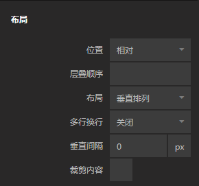
• Position
Controls the layout of this node is in its parent group.
| Option | Description |
| ------------------------------------------- | --------------------------------------------------------------------------------------------------------------------------------------------------------------------------------------------------------------------------------- |
| In Layout | This node is part of the parent group layout, it will be stacked with its siblings depending on the parent group layout settings. |
| Absolute | This node will not be part of the parent group layout, instead you are free to use the Pos X and Pos Y to place this node explicitly. |
| Sticky | Behaves like In Layout, except when the node is about the be scrolled outside the parent. It'll stick to an edge of the parent instead of scrolling away. The edge it sticks to can be controlled with the Alignment input. |
• Layout Direction
By default all children are stacked. This property specifies the stacking direction.
| Data | Description | | -------------------------------------------- | ---------------------------------- | | Vertical | Children are stacked vertically. | | Horizontal | Children are stacked horizontally. | | None | Children are not stacked. |
When making a connection to the layout property, the values are a little different than the ones in the dropdown. Here is a list of the values, that should be passed in:
| Display Name | Value |
| ------------ | -------- |
| Vertical | column |
| Horizontal | row |
| None | none |
• Multi Line Wrap
This property specifies what happens with children that are stacked outside of the border of the node.
| Data | Description | | -------------------------------------------- | ------------------------------------------------------------------------------------------------------ | | Off | Children are stacked beyond the boundaries of the node. If Clip is enabled they will not be visible. | | On | Children are wrapped to the next row or column (depending on layout direction). | | On Reverse | Same as On but opposite layout direction. |
• Gap
This property is used to add spacing between children in the group.
| Data | Description | | ------------------------------------------------ | --------------------------------------------------------------------------------------------------------- | | Vertical Gap | Vertical space between children. Shown if Layout is set to Vertical or Multi Line Wrap is On. | | Horizontal Gap | Horizontal space between children. Shown if Layout is set to Horizontal or Multi Line Wrap is On. |
• Clip content
This property controls if elements that are too big to fit inside the node will be clipped.
If disabled, a group will always expand to contain all of its children. So if the children are taller than the size of the group, the group will expand and be larger than its specified size.
Align and justify content
This Gadget controls how children are aligned and justified by default. Children can override these settings with their Alignment input.

The first set of options control cross-axis alignment, meaning vertical alignment for horizontal layouts, and horizontal alignment for vertical layouts. From left to right, the options are:
| Option | Description | | ---------------------------------------------------- | ------------------------------------------------- | | Align items start | Children are stacked at the start of the parent. | | Align items center | Children are stacked at the center of the parent. | | Align items end | Children are stacked at the end of the parent. |
The second set of options control alignment in the same direction as the layout. From left to right, the options are:
| Option | Description | | --------------------------------------------------------------- | --------------------------------------------------------------------------------------------------- | | Justify content start | Children are stacked at the start of the parent. | | Justify content center | Children are stacked at the center of the parent. | | Justify content end | Children are stacked at the end of the parent. | | Justify content space between | Children are evenly distributed. No space is added between the parent and the first and last child. | | Justify content space around | Children are evenly distributed. Space is added between the parent and the first and last child. | | Justify content space evenly | Children are evenly distributed with equal space between them. |
Scroll
This Gadget controls how scrolling should be handled within the node.

| Data | Description | | ----------------------------------------------- | -------------------------------------------------------------------------------------------------------------------------------------------------------------------------------------------------------------------------------------------------------- | | Enable Scroll | This specifies if the node should have scrolling enabled for children that overflow outside of the nodes boundaries. Scrolling direction is determined by the nodes Layout direction. Enabling this will show the scrolling properties below. |
| Data | Description | | -------------------------------------------------------- | ------------------------------------------------------------------------------------------------------------------------------------------------------------------------------------------------------------ | | Native Platform Scroll | When enabled, uses the web's native scrolling dependent on the platform. Uses custom CIDE scrolling when disabled. The custom CIDE scrolling is platform independent and has both touch and mouse support. | | Show Scrollbar | Only available if Native Platform Scroll is disabled. Toggles the visibility of the scrollbar. | | Bounce at boundaries | Only available if Native Platform Scroll is disabled. Toggles if scrolling bounces when you are at top or bottom of list. | | Snap | Only available if Native Platform Scroll is disabled. Enabling this will snap the scrolling between every screen. | | Snap To Every Item | Only available if Snap is enabled. Enabling this will force the scrolling to snap to individual items. |
Text Style
| Data | Description |
| ------------------------------------------------ | ------------------------------------------------------------------------------------------------------------------------------------------------------------------------------------------------------------------------------------------------------------------------------------------------------------------------------ |
| Text Style | Set an existing text style to this node, or create a new text style from the current properties. |
| Font Family | The font family of the text to display. Choose a font in the project folder or type font name. |
| Font Size | The size of the font of the text to be displayed, in px. |
| Color | The color of the text to be displayed. |
| Letter spacing | The distance between letters in the string to be displayed. Can be specified in the following units: px: Pixels. This is CSS pixels, so one pixel will be two physical pixels on a retina displayem: Relative to the font size. 1em is the same as the current font size |
| Line height | The line height of the string, if the string is on multiple lines. Can be specified in the following units:
No unit: Relative to the current font size. Preferred way to set line height px: Pixels. This is CSS pixels, so one pixel will be two physical pixels on a retina display %: Percentage |
| Case | Control how to capitalize the text: None: Characters are unmodifiedUppercase: All characters will be uppercaseLowercase: All characters will be lowercaseCapitalize: The first letter of each word will be converted to uppercase |
Style
This Gadget controls basic styling of the node.

| Data | Description |
| -------------------------------------------------- | ------------------------------------------------------------------------------------------------------------------------------------------------------------------------------------------------------------------------------------------------------------------------------------------------------ |
| Opacity | The opacity of the node. 0 is completely transparent and invisible. 1 is completely solid and opaque. |
| Background Color | Specifies the background color for this node. |
| Visible | Toggle the visibility of this node on and off. |
| zIndex | The depth index for this node, this can be any number. |
| Blend Mode | Controls how this element should blend with the elements behind it. The blend mode can be set to one of the following: Multiply Normal Screen Overlay Darken Lighten Color Dodge Color Burn Hard Light Soft Light Difference Exclusion Hue Saturation Color Luminosity |
Border Style
The Border Style Gadget is used to style the borders.

You can select to style all borders at once, or only style individual borders. The styling for the individual borders will override the all-borders option.
| Data | Description |
| ---------------------------------------------- | -------------------------------------------------------------------------------------------------------------------------------------- |
| Border Style | Specifies whether this node should have a border and what it should look like. The options are None, Solid, Dotted and Dashed. |
| Border Width | The width of the border. Only available if Border Style is set to have a border. |
| Border Color | The color of the border. Only available if Border Style is set to have a border. |
Corner Radius
The Corner Radius Gadget is used to round the corners of the node.

You can select to set the corner radius all corners at once, or only style individual corners. The styling for the individual corners will override the all-corners option.
The corner radius is specified in px or % of the nodes width.
Box Shadow
You use the Box Shadow Gadget to set the shadow behind or inside of the node.

| Data | Description | | ------------------------------------------------ | ------------------------------------------------------------------------------------------------------------------------------------------------------------------- | | Shadow Enabled | Enables and disables the shadow. | | Offset X | The horizontal offset of the shadow. A positive value puts the shadow on the right side of the node, a negative value puts the shadow on the left side of the node. | | Offset Y | The vertical offset of the shadow. A positive value puts the shadow below the node, a negative value puts the shadow above node. | | Blur Radius | The blur radius. The higher the number, the blurrier the shadow will be. | | Spread Radius | The spread radius. A positive value increases the size of the shadow, a negative value decreases the size of the shadow. | | Inset | Changes the shadow from an outer shadow (outset) to an inner shadow. | | Shadow Color | The color of the shadow. |
Placement
The Placement Gadget lets you offset, rotate and scale the node. It uses CSS Transforms under the hood, meaning that the nod will still take up the original size and position in the visual tree.

| Data | Description | | ---------------------------------------------------- | -------------------------------------------------------------------------------------------------------------------------------------------------------------------------------------------------------------------------------------------------------- | | Pos X | The X position of the node. Either relative to its parent top left corner or relative to its layout position depending on the Position property. Can be specified in pixels or as a percentage of its parent's width. | | Pos Y | The Y position of the node either relative to its parent's top left corner or relative to its layout position depending on the Position property. Can be specified in pixels or as a percentage of its parent's height. | | Rotation | The rotation in degrees. | | Scale | Specifies scaling of this node. A value of 0 scales the node down completely so that it is no longer be visible. A value of 1 gives it the original size, and a value of 2 doubles the size and so on. | | Transform Origin X | Specifies the X position, within this node, that will be the center for rotation and scale. By default it is the center of the node (i.e. 50%) but you can specify an arbitrary value in either percentage of the node's width or explicitly in pixels. | | Transform Origin Y | Specifies the Y position, within this node, that will be the center for rotation and scale. By default it is the center of the node (i.e. 50%) but you can specify an arbitrary value in either percentage of the node's height or explicitly in pixels. |
Dimension Constraints
The Dimension Constraints Gadget allows you to clamp the values of the Dimensions Gadget.

| Data | Description | | -------------------------------------------- | --------------------------------------------------------------------------------------------------------------------------------------------------------- | | Min Width | The minimum width that can be assumed by growing with children or parent. Can be specified in % or pixels, or vw which is percentage of window width. | | Max Width | The maximum width that can be assumed by growing with children or parent. Can be specified in % or pixels, or vw which is percentage of window width. | | Min Height | The minimum height that can be assumed by growing with children or parent. Can be specified in % or pixels, or vh which is percentage of window height. | | Max Height | The maximum height that can be assumed by growing with children or parent. Can be specified in % or pixels, or vh which is percentage of window height. |
Focus
| Signal | Description | | ----------------------------------------- | --------------------------------------------------------------------------------------------------------------------------------------- | | Focus | Focuses this node. Will trigger the Focused signal output on this node, as well as Focused Lost on other nodes that now lost focus. |
Other
| Data | Description |
| -------------------------------------------------------- | --------------------------------------------------------------------------------------------------------------------------------------------------------------------------------------------------------------------------------------------------------- |
| Pointer Events Mode | This specifies how this node responds to pointer events.Inherit sets the node to respond to pointer events in the same way as its parent.Explicit sets the node to respond to pointer events as specified by Pointer Events Enabled. |
| Pointer Events Enabled | This property is only available if Pointer Events Mode is set to Explicit. It will specify if this node responds to pointer events or not. If set to false this node will completely ignore pointer events. |
| Block Pointer Events | This will cause this node to block all pointer events, e.g. any node that is behind this node will not receive pointer events. |
| Mounted | This property is used to completely remove the node from the DOM. If this property is set to false the node is removed from the visual tree. It differs from the Visible property where the node is still part of the visual tree but invisible. |
Advanced HTML
| Data | Description | | ------------------------------------------- | --------------------------------------------------------------------------------------------------- | | Tag | The tag used when this node renders in the app. Only available on the Group and Text nodes. | | CSS Class | Specify a CSS class this node will have. | | CSS Style | Use this property to specify your custom CSS. |
视觉节点输出属性
Scrolling
| Data | Description | | ------------------------------------------------- | -------------------------------------------- | | Scroll Position | The current position of scrolling in pixels. |
| Signal | Description | | ------------------------------------------------ | ------------------------------------- | | Scroll Start | Signal emitted when scrolling starts. | | Scroll End | Signal emitted when scrolling ends. |
Bounding Box
| Data | Description |
| --------------------------------------------------- | ------------------------------------------------------------------------------------------- |
| Screen Position X | Where this node is on the screen's X-axis, in px. |
| Screen Position Y | Where this node is on the screen's Y-axis, in px. |
| Width | Current width of this node. |
| Height | Current height of this node. |
Mounted
| Signal | Description | | ------------------------------------------------ | ------------------------------------------------------------------------------------------------------------------------------------- | | Did Mount | Signal sent when this node has been mounted, i.e. has become part of the visual tree and is visible. | | Will Unmount | Signal sent when this node is about to be removed from the visual tree and become hidden. |
Pointer Events
| Signal | Description | | ------------------------------------------------- | --------------------------------------------------------------------- | | Click | Triggered when the node is clicked or tapped. | | Pointer Down | Triggered when the mouse is pressed or finger is down on the node. | | Pointer Up | Triggered when the mouse is released or finger is lifted on the node. | | Pointer Enter | Triggered when the mouse enters the node. |
Hover Events
| Signal | Description | | ----------------------------------------------- | ----------------------------------------- | | Hover Start | Triggered when the mouse enters the node. | | Hover End | Triggered when the mouse leaves the node. |
Focus
| Signal | Description | | ------------------------------------------- | --------------------------------------------------------------------------------------------------------------------------------- | | Focused | Triggered when the node, or one if its descendants, is clicked, or if the Focused input is triggered. | | Blurred | Triggered when this node had focus and another node gained focus. Focus is only lost if the new focused node is not a descendant. |
Other
| Data | Description |
| ------------------------------------------------ | ---------------------------------------------------------------------------------------------------------------------------------------------------------------------------------------------------------------------------------------- |
| Child Index | The place this node has in relation to its parent. E.g. if a Group has three children, then the first child will have Child Index 0, the second child will have Child Index 1, and so on. |
| This | A reference to this node. Used in custom JavaScript nodes and more. |
| Children Count | Outputs the number of children that this node has (if the node supports children). |